The challenge: to create inaugural labels for a fictional microbrewery from the cheekily named Blue Ball, Pennsylvania; the beer names and descriptions were a given.
Here we have craft beer, generally appealing to a younger and more hip, cosmopolitan demographic; a Pennsylvania-Dutch small town, somewhat removed from that demo’s natural hub; and a cheeky name (which, oddly, is a mainstay of towns in Amish country). I wanted the design to bridge the divide in a fun way, as if you’d gotten a modern wink & nod while antiquing.

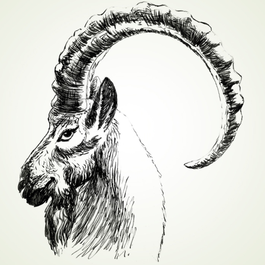
I created the four faces to embody that “wink & nod”, detailed yet jaunty pen illustrations inspired by 19th century cartoons like those of Thomas Nast.


For the front labels’ layout, I was inspired by highly decorative antique frames, particularly for round pictures and clocks. The decorations evoke the distinctive taste notes of each beer with wheat and other ingredients, like coffee for the stout and aromatics for the Scarlet Lady Ale. Each beer also pops with its own color scheme, complementing a bluish primary hue with a unique secondary color.


